When organizing an event, you are sure to be very clear about the type of person you want to attend. You have already defined a target audience with specific interests, who would not like to be left out. Perhaps you have an exclusive web page to inform about the content of the event, the date, the place and the talks that are going to be given. If you don’t have it yet, you’re wasting a great opportunity to make it known. Even if it’s just a one-off event and isn’t planned to be held regularly at the moment, it’s essential to have a website where people can find out all the details and register. But, before we continue, let’s see exactly what a landing page is.
What is a landing page?
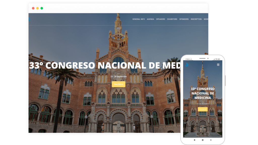
The meaning of landing page is better understood from its translation into Spanish: landing page. When we talk about a landing page, we refer to an individual page with a single specific objective. Some people may already know about the event and want to sign up directly, but others may arrive completely unaware of it. That is why it is important that your landing page has all the necessary information for both audiences. For Meetmaps clients, for example, it works very well to have a landing page where a little more information about the content of the event is offered, perhaps with an explanatory video. In other cases, a pre-launch landing page is often used for interested people to register and be notified by email when tickets go on sale. This last option works very well because it is like giving a VIP or priority service to those who register. To achieve a perfect landing page, the content is designed so as not to distract the user and lead them to carry out the action we want, whether it is a registration, a direct sale or attendance at a free webinar.
How to make an effective landing page?
Now that we know the importance of having a landing page, let’s see how to design it so that it fulfills its function as well as possible. For a landing page to meet its objective and have a high conversion rate, its content must be planned very well. From the beginning to the end.
Title
The headline is the first thing read when entering the landing page. Hence the importance of choosing the words that are going to be used well. It must capture the user’s attention, generally the title is the name of the event, but you can choose another phrase of between 5 and 10 words so that the user is put in a situation just by reading it.
Main idea
Although the text explains different ideas in detail, it should be focused on one main idea, which is the description of the event. Being a space to describe a little what the attendee is going to find in the event, it should not be a text that is too long or loaded with information. A simple and clear explanation will make the user understand the main ideas of the event and convince them to register. When we browse the Internet, we all want speed and immediacy. If the text is too long, it is possible that users leave the page without fulfilling our objective.
Persuasive content
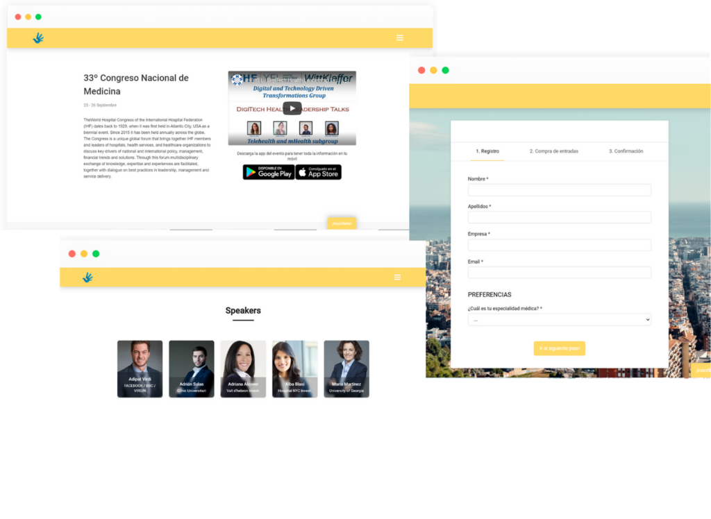
To persuade is to convince, but with logical reasons and arguments. In other words, the more persuasive the content, the more likely it is to achieve the objective of the page. We insist that you should not exaggerate or promise impossible things. The idea is to use words, images and videos to guide the user to the point where they decide to take a very specific action. This is an art, and ideally, a copywriting expert is in charge of this task. However, we will give you 7 practical tips that you should keep in mind:
- The first sentences should be focused on making the reader feel identified with a problem, doubt or situation that can be resolved if he continues reading.
- Use headings or subheadings to make it easy to visually scan the content. In addition, that also helps to optimize the text for search engines.
- It is highly recommended to put a video or image on the landing page to give an alternative to those lazy people who do not want to read the content in text.
- Highlight the benefits of carrying out the action you are promoting, whether it is a purchase or a registration by email.
- Present the agenda and the speakers of the event after the presentation so that the attendees organize themselves and know a little more.
Presentation of exhibitors and sponsors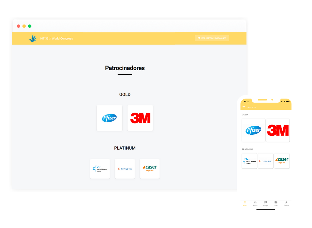
It is very important that on the website of your event you present, in addition to all the basic information about the event, the brands that are going to participate in it. The landing page has an exclusive space to show the exhibiting and sponsoring companies of the event. As you well know, they have a very important role, since you will create business opportunities for the companies participating in the event with an exclusive digital space and in return they will provide financing in your event. Don’t forget about them!
Extra information for the assistant
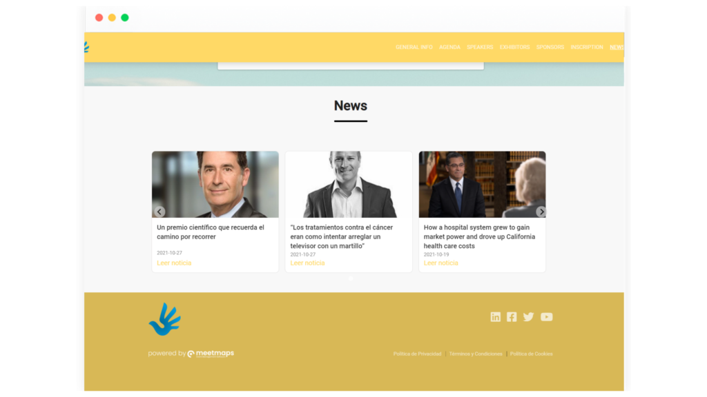
Make the most of the space to add the latest details on your event website. You can add outstanding news of the event that will make the attendee up to date, and you can also add a map so that the user knows where the face-to-face event is. In addition, you will have a footerto show the networks and the contact to the attendees who want to follow the event.
Why do you need a landing page for your event?
As you just read, a landing page plays a very important role when organizing an event. It’s where people will go to learn more about your content, where you can finally persuade them to sign up. Making use of well-designed landing pages can make a world of difference. They will help you get a perfect event. They will improve the reach and brand image of the event. In short, everything has advantages. Landing pages are very effective weapons that should not be missing from your marketing strategy. Using them together with our event solutions is the winning combination for a successful event.
